
UPI on homepage / Case study 01
How Navi became the 4th largest UPI app.
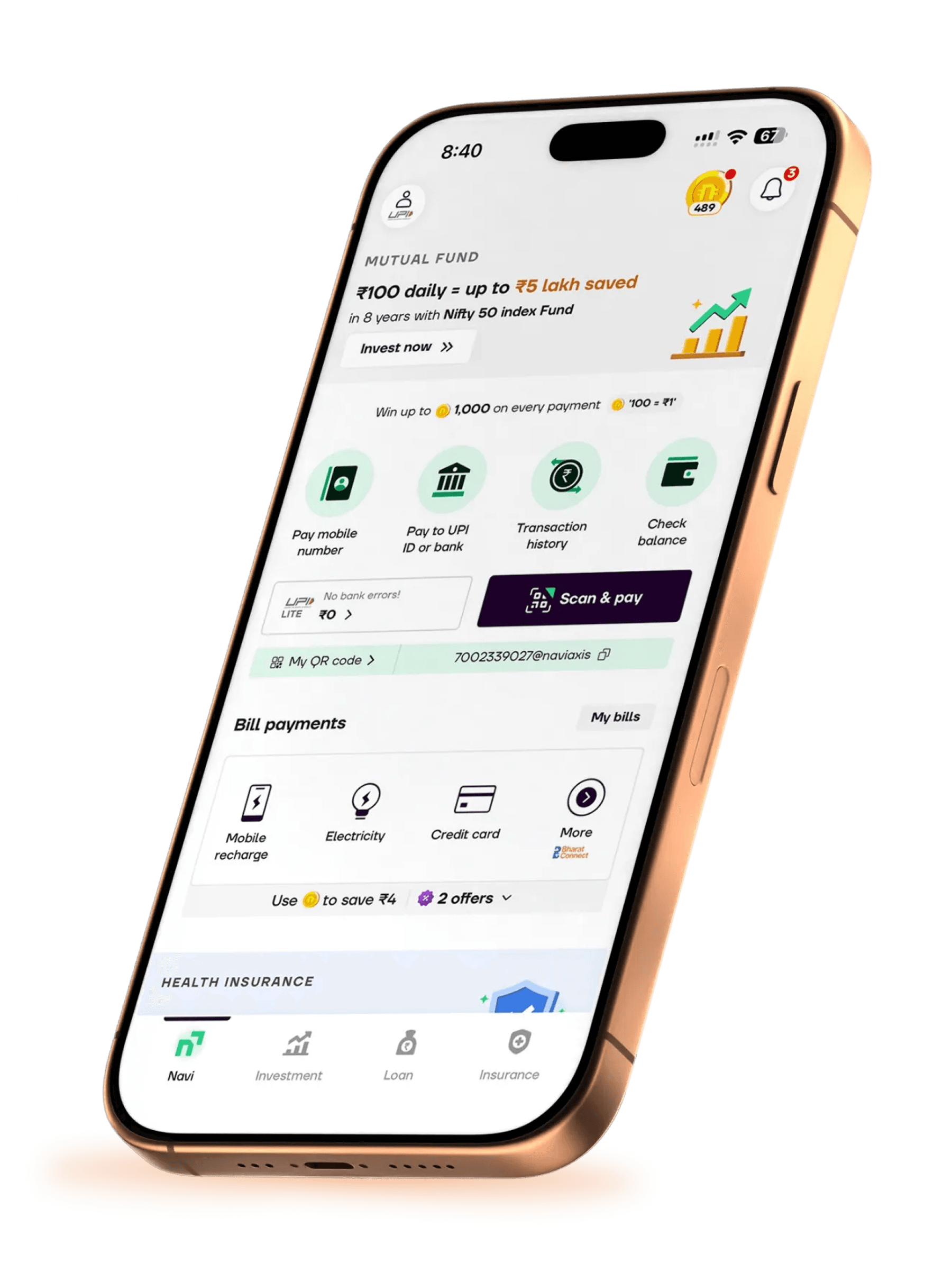
01 / Objective
Make Scan & Pay instantly accessible.
Design a UPI-first home screen and communicate incentives that give people a reason to activate it.
The trade-off
UPI growth could put loans at risk.
We planned for a ~15–25% dip in loans engagement and conversions, with a projected recovery window of ~9–12 months.
02 / Outcome
Navi became the 4th largest UPI app by payment volume.
A year of acquiring new users and making the experience seamless brought Navi into the top four UPI apps.
Signals
CAC reduced drastically.
The homepage target was 25% UPI activation from its traffic.
03 / Learning
Muscle memory exists, but behaviour adapts.
Quick experiments showed that familiar payment habits are real—but a clearer, better-rewarded path can build a new one.
The full story follows the homepage, the damage control and the GTM work behind it.
Opens the interactive Figma deck